Why Simple Sites Are Better
Let's clear the air about the simplification and evolution of our site and logo.
Website are too noisy
With the digital landscape saturated with complex designs, a simple website offers a refreshing change, conveying clarity and focus. Keeping things simple makes information easier to find and use, unlike so many distracting trends today.
My extensive career as a senior software engineer has instilled in me an appreciation for sophisticated design. Simple-Earth.org actually started as a WordPress site with custom coding. I have learned that a website’s actual worth is its capacity to deliver information clearly and efficiently to users.
Simple-Earth.org is now plain, easy to read, mostly text based, and a base of information. No more lipstick on a pigs here. 

Reasoning
If you need more convincing, then it is simple with some facts.
Basic websites:
- load faster, because there's less background, hidden code and aesthetics
- navigates easier with less buttons, widgets and social gizmo's everywhere
- costs less to maintain when you have less code and infrastructure to inspect
- have wider compatibility with everyones devices, a no-brainer
- performs better, because it uses less processor, GPU and memory reources on your device
- focuses on content – not on trying to engage and keep you around to see more ads
- is more accessible to general users and those with visual or aural impairments.
- is more reliable for many of the above reasons
- is more secure, because less code means less bugs.
Simple-Earth, should be simple
Simple websites are practical and save resources; that is what it means. Keeping costs low and things simple helps my site stay up for everyone. I take care of my own servers and sites—keeping it simple is essential.
This method lets me concentrate on what’s important: creating valuable content and connecting with my audience. With the digital noise out there, this website is my idea of ‘data without distortion’.
The New Logo
If you recall our previous logo (below), you'll recognize it from our website, Instagram, YouTube, and even our vehicles. It served us faithfully by symbolizing the primitive, manual, and challenging work within our natural surroundings. That emblem represented everything from our first homestead and mid-way farm to the early days of Windhelm. I still cherish the old design—its shapes, colors, and simplicity all carried meaning. Our thanks to Tiaan van Wyk for creating it.

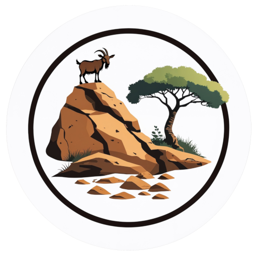
The new logo embodies our evolution. We've transitioned from days spent harvesting and constructing basic infrastructure to transforming our dry, challenging environment into a sanctuary for our animals.
At its center stands our primary livestock—representatives of regenerative grazing and providers of far more than sustenance. The goat symbolizes all our animals as true collaborators in this shared endeavor. The rock beneath signifies our now-solid footing after years of uncertainty, while also acknowledging our most abundant resource: difficult terrain. The Aloe captures our biome, the precious rarity of green flora, and their remarkable resilience here.
This design speaks to space, growth, progress, friendship, and symbiosis. We've maintained a simple, printable, and recognizable form with colors that reflect both our climate and our determination.

